As students explore statistics and data analysis with R, learning to visualize data is the key. Good visualizations help make sense of data and clearly present the results. R’s strong visualization package, such as ggplot2, simplifies this process of visualizing data. Let us explore 12 essential plots every student should master in R for their assignments and projects.
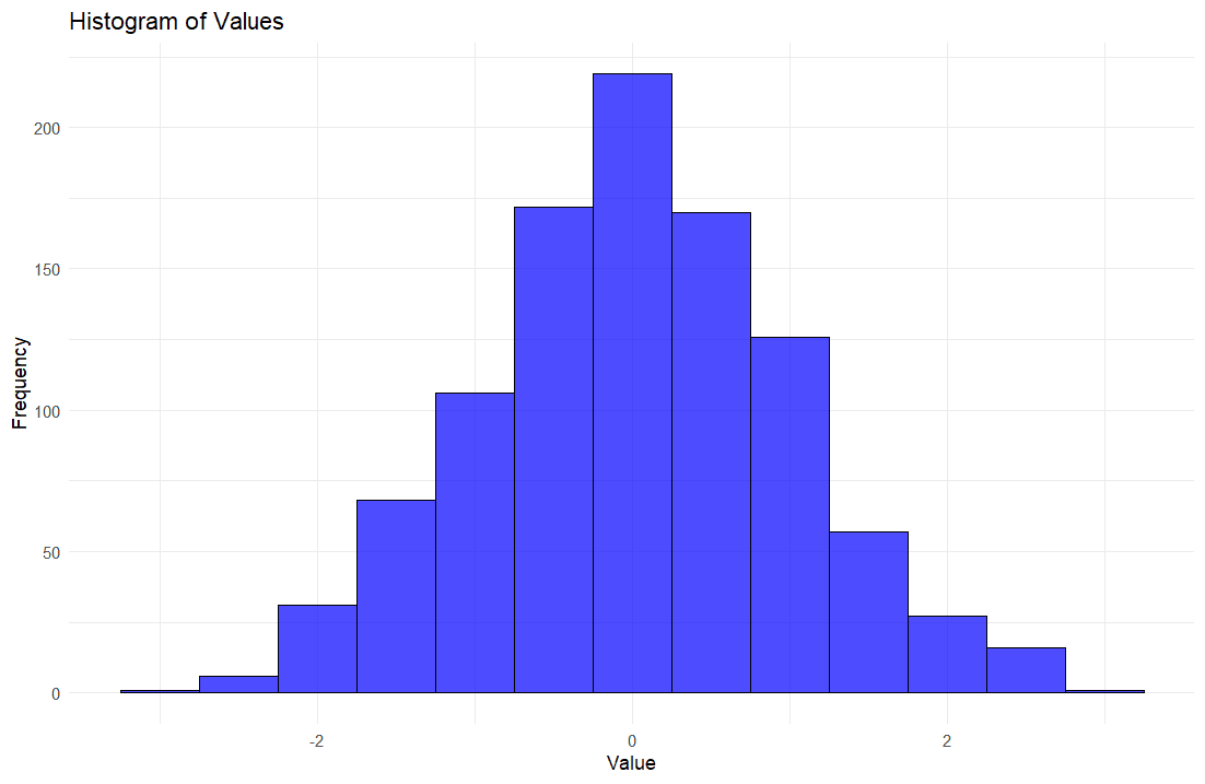
A histogram shows how numerical data is distributed. It’s especially useful for understanding the frequency distribution of a dataset.
Example:
# Load ggplot2
library(ggplot2)
# Generate example data
set.seed(123)
data <- data.frame(value = rnorm(1000))
# Create histogram
ggplot(data, aes(x = value)) +
geom_histogram(binwidth = 0.5, fill = "blue", color = "black", alpha = 0.7) +
labs(title = "Histogram of Values",
x = "Value",
y = "Frequency") +
theme_minimal()
Scatter plots are used to display values for two variables for a set of data, allowing for the visualization of the relationship between the variables.
Example:
# Generate example data
data <- data.frame(x = rnorm(100), y = rnorm(100))
# Create scatter plot
ggplot(data, aes(x = x, y = y)) +
geom_point(color = "blue") +
labs(title = "Scatter Plot of X vs Y",
x = "X",
y = "Y") +
theme_minimal()

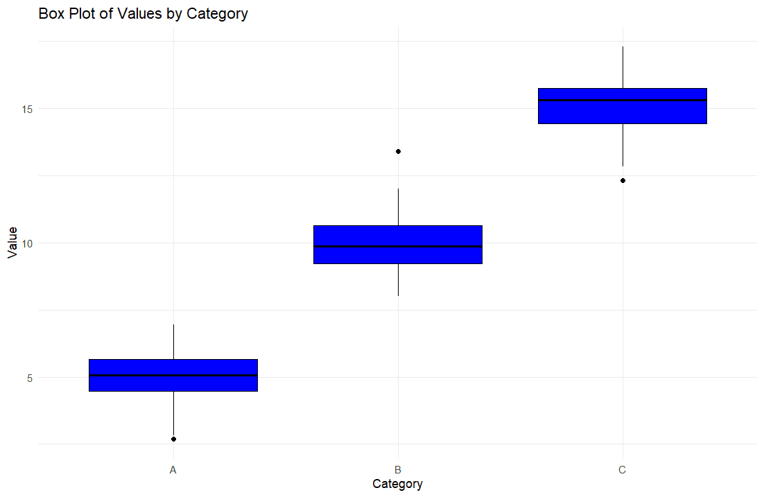
Box plots are useful for displaying the distribution of a dataset based on a five-number summary: minimum, first quartile, median, third quartile, and maximum.
Example:
# Generate example data
data <- data.frame(category = rep(c("A", "B", "C"), each = 100),
value = c(rnorm(100, mean = 5), rnorm(100, mean = 10), rnorm(100, mean = 15)))
# Create box plot
ggplot(data, aes(x = category, y = value)) +
geom_boxplot(fill ="blue", color = "black") +
labs(title = "Box Plot of Values by Category",
x = "Category",
y = "Value") +
theme_minimal()
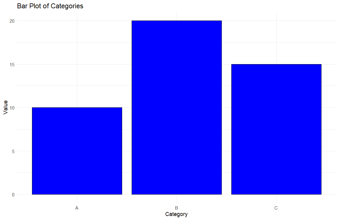
Bar plots represent categorical data with rectangular bars. The heights of the bars are proportional to the values they represent.
Example:
# Generate example data
data <- data.frame(category = c("A", "B", "C"), value = c(10, 20, 15))
# Create bar plot
ggplot(data, aes(x = category, y = value)) +
geom_bar(stat = "identity", fill = "blue", color = "black") +
labs(title = "Bar Plot of Categories",
x = "Category",
y = "Value") +
theme_minimal()
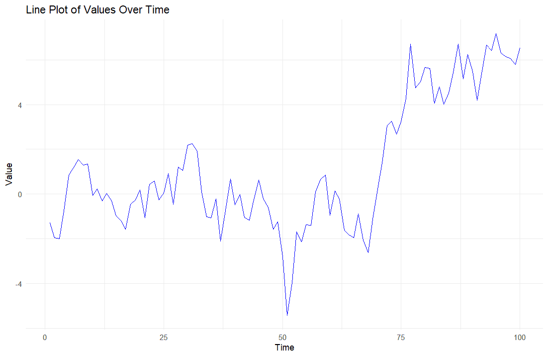
Line plots are used to display trends over time or ordered categories.
Example:
# Generate example data
data <- data.frame(time = 1:100, value = cumsum(rnorm(100)))
# Create line plot
ggplot(data, aes(x = time, y = value)) +
geom_line(color = "blue") +
labs(title = "Line Plot of Values Over Time",
x = "Time",
y = "Value") +
theme_minimal()
Density plots are used to estimate the probability density function of a continuous random variable.
Example:
# Generate example data
data <- data.frame(value = rnorm(1000))
# Create density plot
ggplot(data, aes(x = value)) +
geom_density(fill = "blue", alpha = 0.7) +
labs(title = "Density Plot of Values",
x = "Value",
y = "Density") +
theme_minimal()

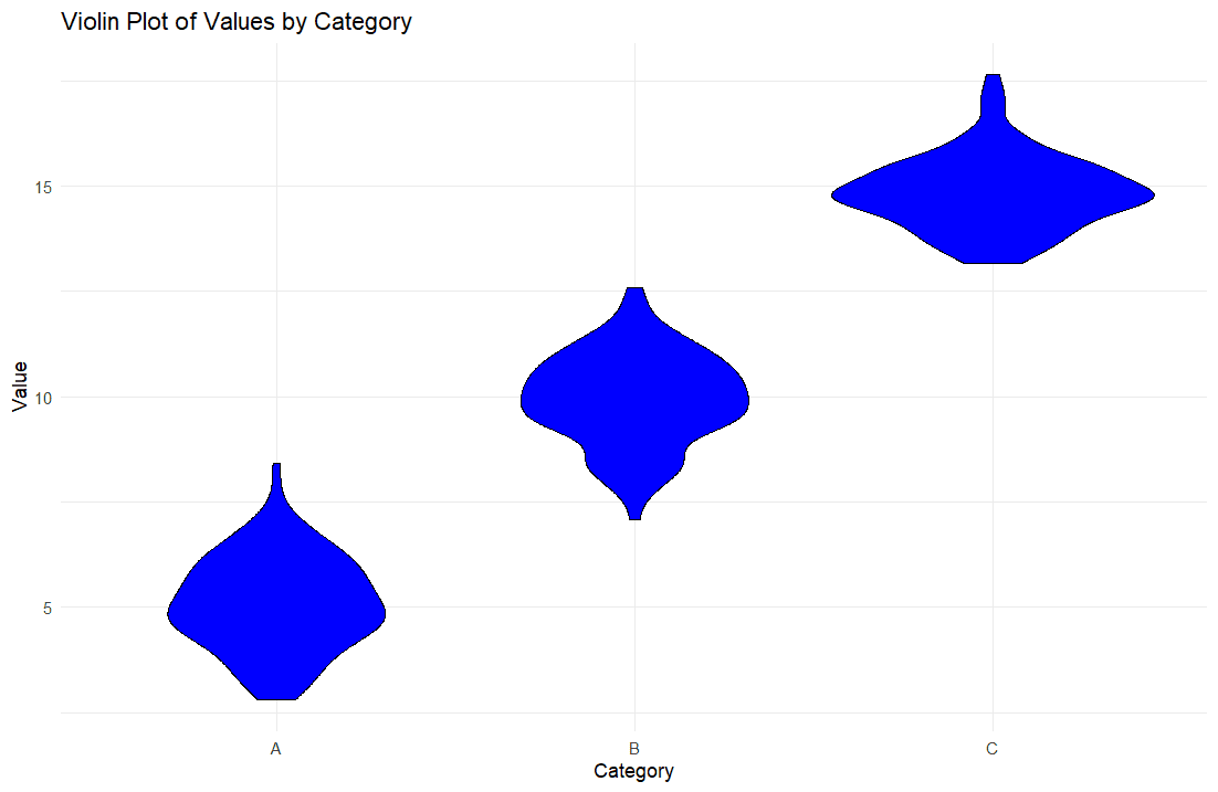
Violin plots combine the features of a box plot and a density plot, providing a richer description of the data distribution.
Example:
# Generate example data
data <- data.frame(category = rep(c("A", "B", "C"), each = 100),
value = c(rnorm(100, mean = 5), rnorm(100, mean = 10), rnorm(100, mean = 15)))
# Create violin plot
ggplot(data, aes(x = category, y = value)) +
geom_violin(fill = "blue", color = "black") +
labs(title = "Violin Plot of Values by Category",
x = "Category",
y = "Value") +
theme_minimal()
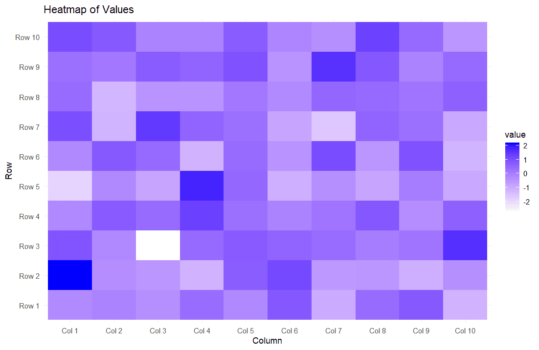
Heatmaps are used to represent data matrices, showing the intensity of values at the intersection of two variables using a color gradient.
Example:
# Generate example data
data <- matrix(rnorm(100), nrow = 10)
rownames(data) <- paste("Row", 1:10)
colnames(data) <- paste("Col", 1:10)
# Create heatmap
library(reshape2)
melted_data <- melt(data)
ggplot(melted_data, aes(x = Var2, y = Var1, fill = value)) +
geom_tile() +
scale_fill_gradient(low = "white", high = "blue") +
labs(title = "Heatmap of Values",
x = "Column",
y = "Row") +
theme_minimal()
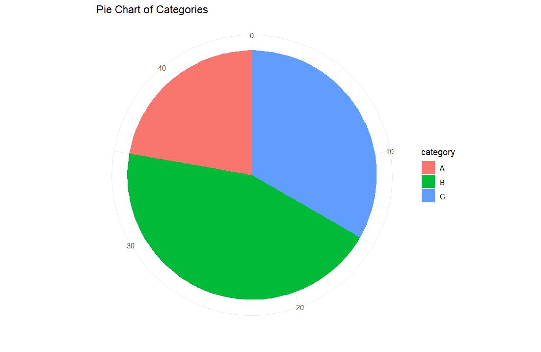
Pie charts show proportions of a whole as slices of a pie. They are useful for displaying categorical data with a small number of categories.
Example:
# Generate example data
data <- data.frame(category = c("A", "B", "C"), value = c(10, 20, 15))
# Create pie chart
ggplot(data, aes(x = "", y = value, fill = category)) +
geom_bar(stat = "identity", width = 1) +
coord_polar(theta = "y") +
labs(title = "Pie Chart of Categories",
x = "",
y = "") +
theme_minimal()
Bubble plots are an extension of scatter plots where a third variable is represented by the size of the points.
Example:
# Generate example data
data <- data.frame(x = rnorm(100), y = rnorm(100), size = abs(rnorm(100)) * 10)
# Create bubble plot
ggplot(data, aes(x = x, y = y, size = size)) +
geom_point(alpha = 0.7, color = "blue") +
labs(title = "Bubble Plot of X vs Y",
x = "X",
y = "Y") +
theme_minimal()

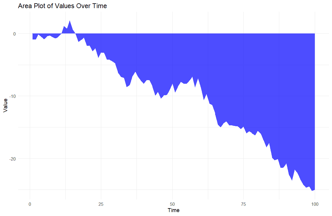
Area plots are similar to line plots but with the area below the line filled. They are useful for showing cumulative totals over time.
Example:
# Generate example data
data <- data.frame(time = 1:100, value = cumsum(rnorm(100)))
# Create area plot
ggplot(data, aes(x = time, y = value)) +
geom_area(fill = "blue", alpha = 0.7) +
labs(title = "Area Plot of Values Over Time",
x = "Time",
y = "Value") +
theme_minimal()
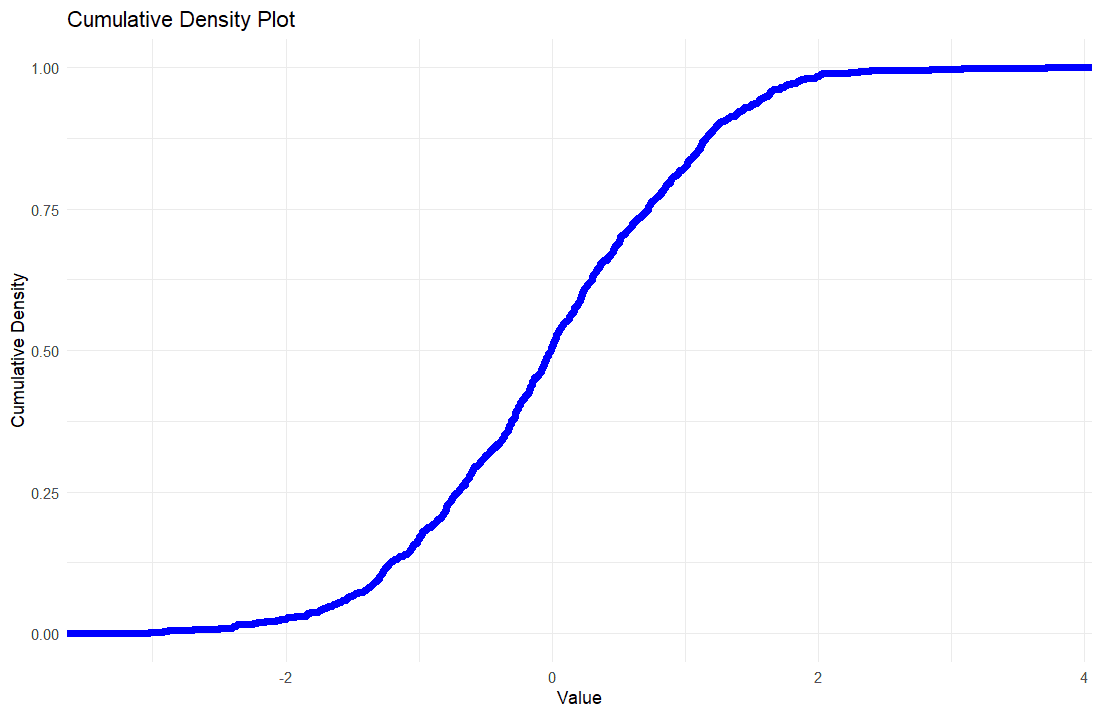
Cumulative density plots are used to show the cumulative distribution of a variable.
Example:
# Generate example data
data <- data.frame(value = rnorm(1000))
# Create cumulative density plot
ggplot(data, aes(x = value)) +
stat_ecdf(geom = "step", color = "blue", size = 1) +
labs(title = "Cumulative Density Plot",
x = "Value",
y = "Cumulative Density") +
theme_minimal()
Most of the students pursuing data analytics and statistics courses find difficulties in understanding R Studio codes and software. We provide R Studio Assignment Help to make learning and coding easier. Our qualified R Studio homework help tutors have the required expertise and experience in solving the trickiest questions involving R. Our comprehensive solutions not only describe the analysis process, demonstrate visualizations and interprete results, but we also provide software steps as a guidance so that students can perform the steps at their end for quick learning.
We furnish comprehensive data analysis reports strictly adhering to the assignment instructions, data and rubric. Each report contains:
We provide step-by-step solution to help you understand the methodology and application of R in data analysis, our experts describe each part of the code and the rationale behind it. Apart from the solution, we also provide the software steps we have formed in R as a guide that helps students to learn the process themselves to generate the results.
Apart from assignments, we also offer help with R Studio quizzes and exams as well. Our services come with guaranteed grades on your exams with quality problem solving skills and shortcuts to solve complex problems quickly.
Visualization of data is considered as one of the essential part of data analysis. There are 12 major types of R visualizations that will enable you to examine and represent data completely, starting from histograms up to cumulative density plots. The student who is well versed with these visualizations acquires an upper hand in their assignments and projects as they improve their analytical ability and effectively articulate the outcomes.
What we offer with our R Studio Assignment Help is meant to help you along the way on your journey of learning the language of R. This includes detailed reports, step by step solutions and quizzes/ exams assistance among others which make your learning process more convenient than ever before. In regard to this, count on us for reliable, high quality yet affordable help that matches your specifications.
Sign up for free and get instant discount of 12% on your first order
Coupon: SHD12FIRST