Definition:
Scatter Plot or Scatter Diagram is a graphical representation of relationship between two quantities variables, and a trend line is a line that provides an approximation of the relationship.
A graph of bivariate data in which the independent variable is on the horizontal axis and dependent is on vertical axis.
As an illustration consider the advertising/sales relationship for an equipment store. On 10 occasions during past three months the store used weekend commercials to promote sales at its stores. A sales person wants to check whether there is any relationship between number of commercials shown and sales at store.
| Week | No. of commercials(x) | Sales($100s)(y) |
| 1 | 2 | 50 |
| 2 | 5 | 57 |
| 3 | 1 | 41 |
| 4 | 3 | 54 |
| 5 | 4 | 54 |
| 6 | 1 | 38 |
| 7 | 5 | 63 |
| 8 | 3 | 48 |
| 9 | 4 | 59 |
| 10 | 2 | 46 |
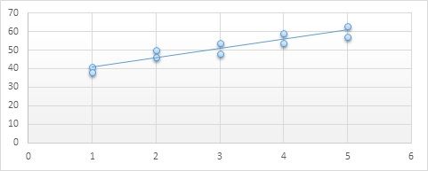
X-axis – number of commercial shown.
Y-axis – sales
the finalized scatter diagram signifies a positive relationship between number of commercials and sales. More sales are related with more number of commercials shown.
So it can be stated from the Scatter plot above that the data have a positive relationship.
To Construct the Scatter Diagram in excel.
Step 1: Select the data set in excel
Step 2: Click the insert tab on ribbon.
Step 3: In the chart group select Scatter
A trend line can be added to the scatter diagram as follows.
Step 1: Place the cursor on any data point in the scatter diagram and right click which indicates the options available.
Step 2: Choose Add trend line.
To Submit your assignment on scatter plot please click the button below
SUBMIT ASSIGNMENT NOW!Sign up for free and get instant discount of 12% on your first order
Coupon: SHD12FIRST